Cavazos Architect Redesign
Overview: Redesign the website for Cavazos Architects and Assoc.
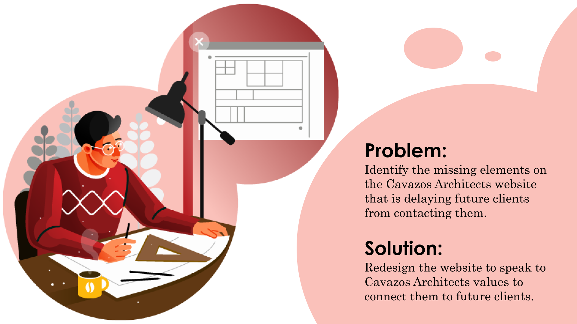
When Mr. Cavazos reached out to us to ask for a redesign, he wasn’t sure what he was looking for. He knew he wanted a refresh but didn’t know what that would look like or what the process would be like. I spoke with and through several meetings we uncovered that he felt the persona of the business was not being portrayed accurately. And this was ultimately leading to a lack of trust from potential clients who didn’t understand the process and values of Cavazos Architects.
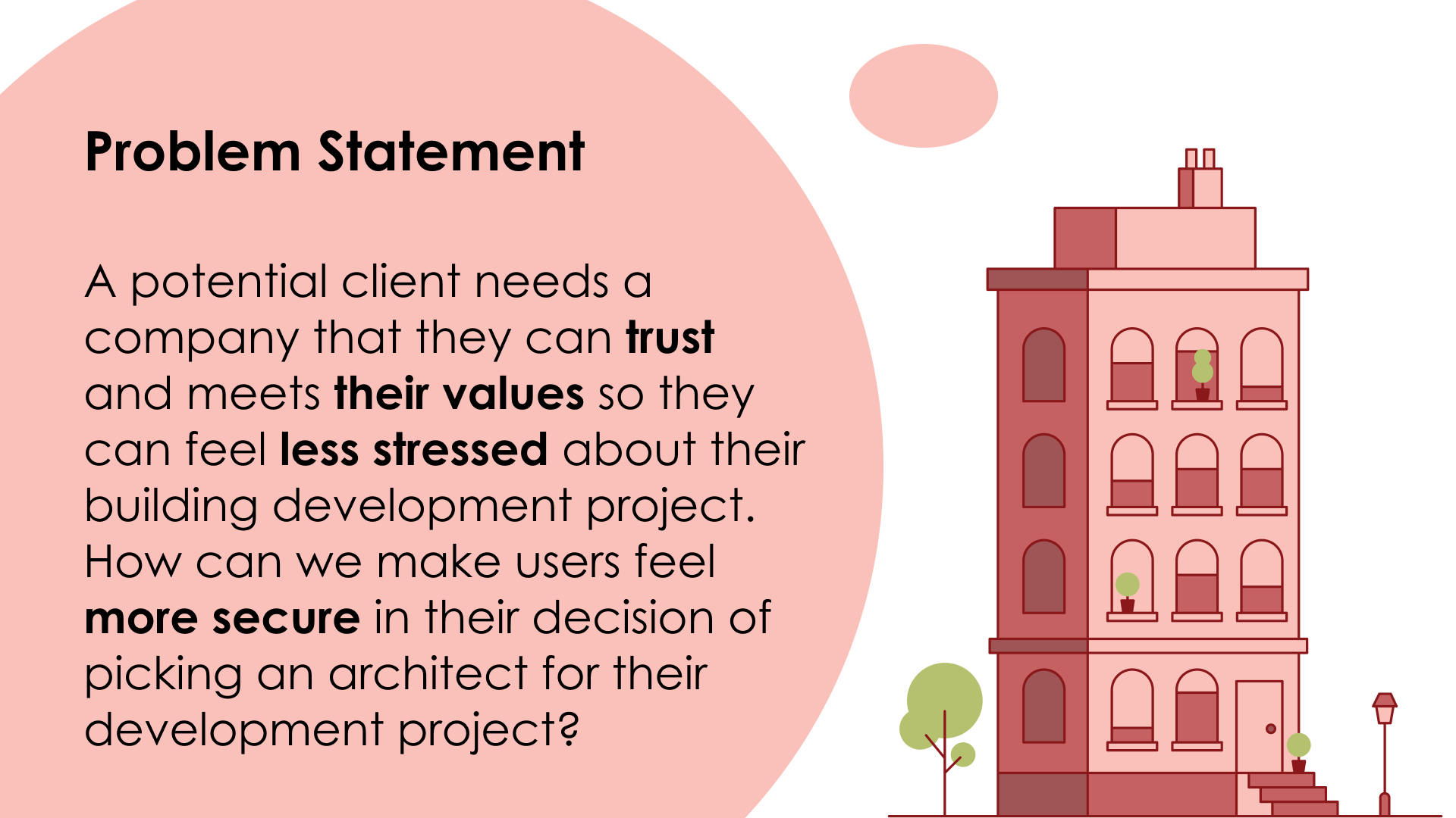
Once we defined the issues with the current website, we outlined our problem statement. Knowing that users must feel stressed with vague statements, we had to ask ourselves, how can we make users feel more secure? We want users to feel like they can trust Cavazos Architects with their building and design needs.
With a problem set in mind, we needed to find a solution. Users need to understand what Cavazos Architects provides and how they can rely on them. Speaking with Mr. Cavazos, I learned more about his process giving me more insight into their values and process. Using this information, we created our value proposition. Mr. Cavazos was currently underselling his brand, and to relieve tension from future clients, he needed to showcase his values.
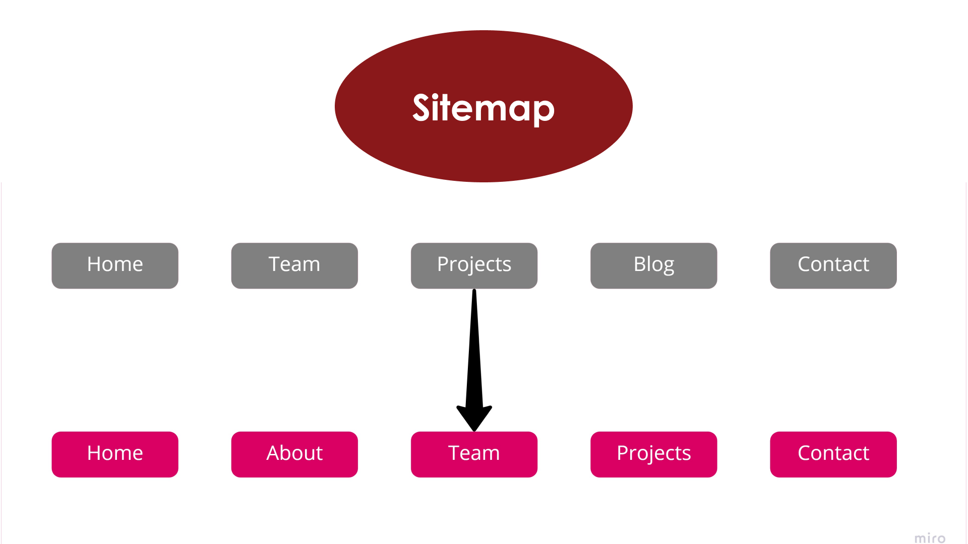
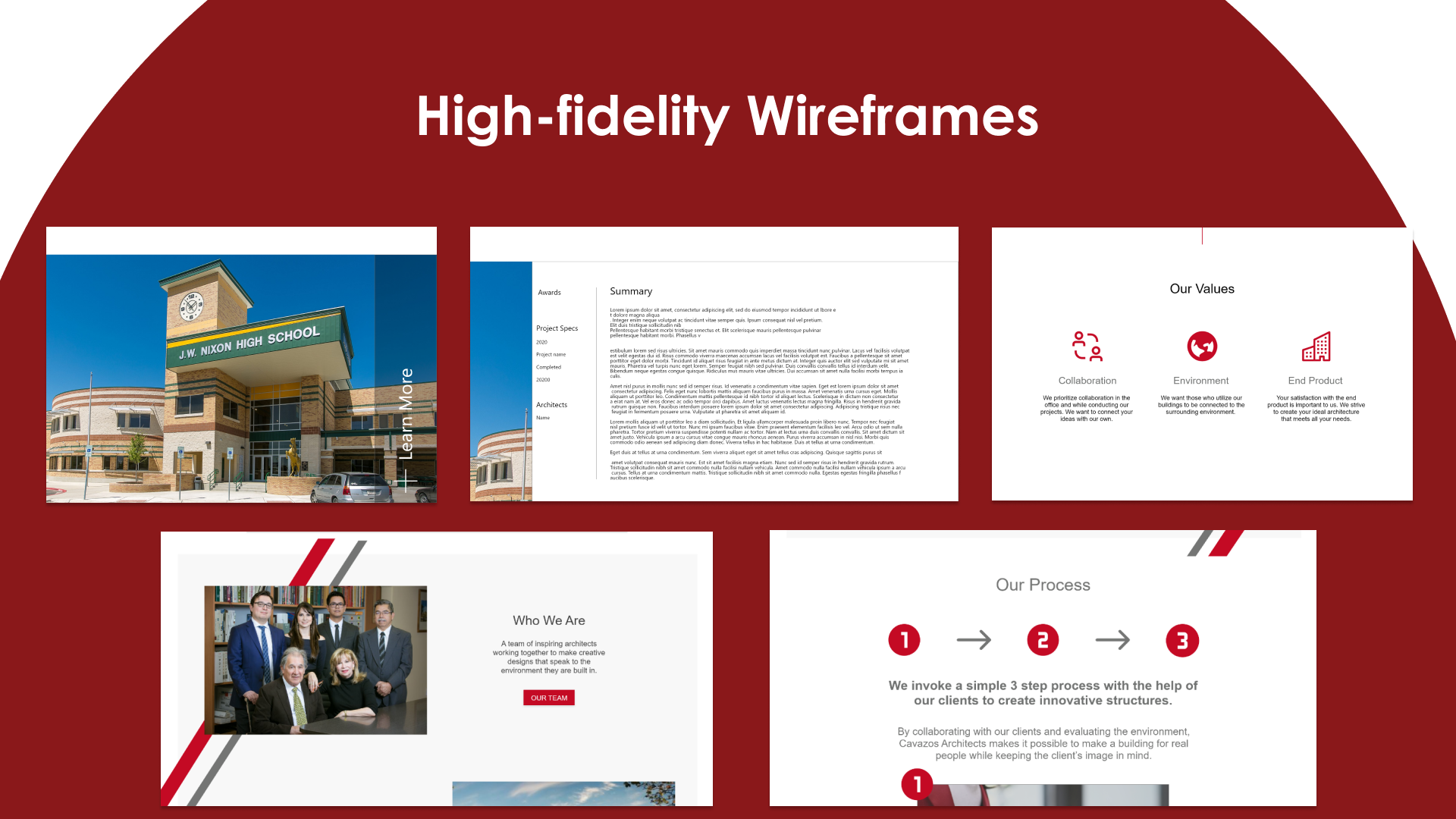
We decided to restructure the sitemap to put more value into what users would learn about Cavazos Architects. To do this, we decided separating the Team page into Team and About pages would provide a more holistic representation of Cavazos’ values. The goal then became how can we present new forms of information detailing the process Cavazos Architects provides during their projects that portray their beliefs. This led us to the next step of building Hi-Fi wireframes.
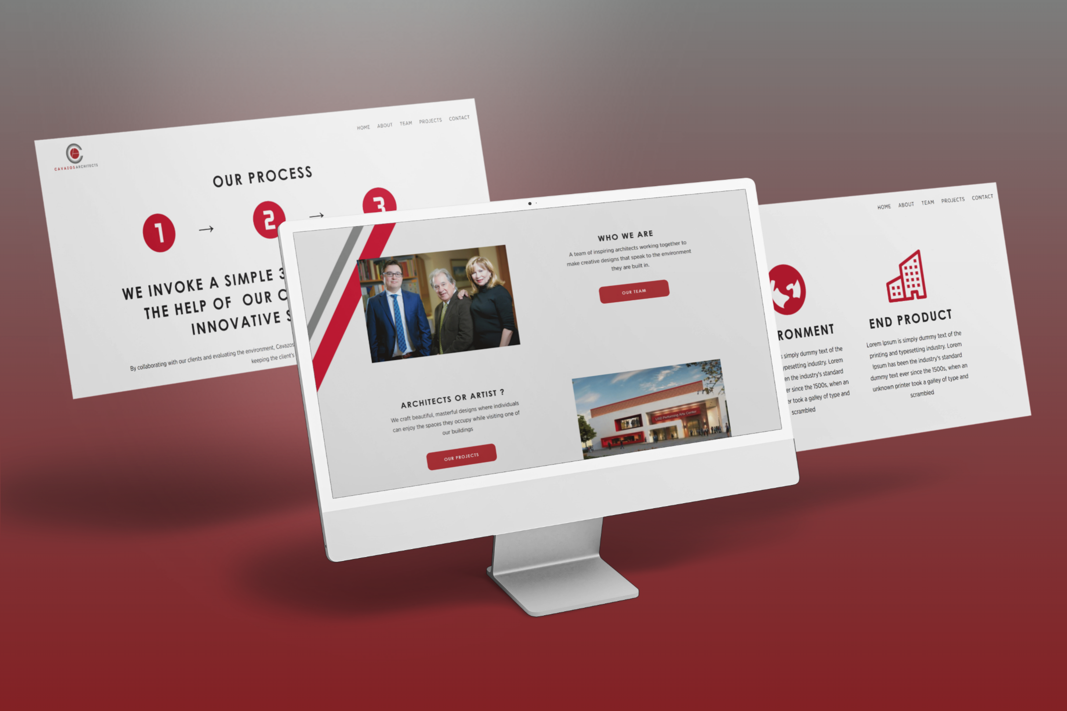
In order to better describe their process and values, we included indicators that emphasizes their principles. When I spoke with Mr. Cavazos he mentioned the collaboration effort that goes into their process and his goal to “make lasting environments that connect people together”. I wanted to speak to his virtue by laying out a simple, clean icon design with small body text that summarizes each value.
Additionally, we further emphasized their process of collaboration in their “our process” section of the home page. Again, we stuck with a simple, clean look to give a modern feel and to make the content itself more apparent. Once our wireframes were set up, user testing was conducted.
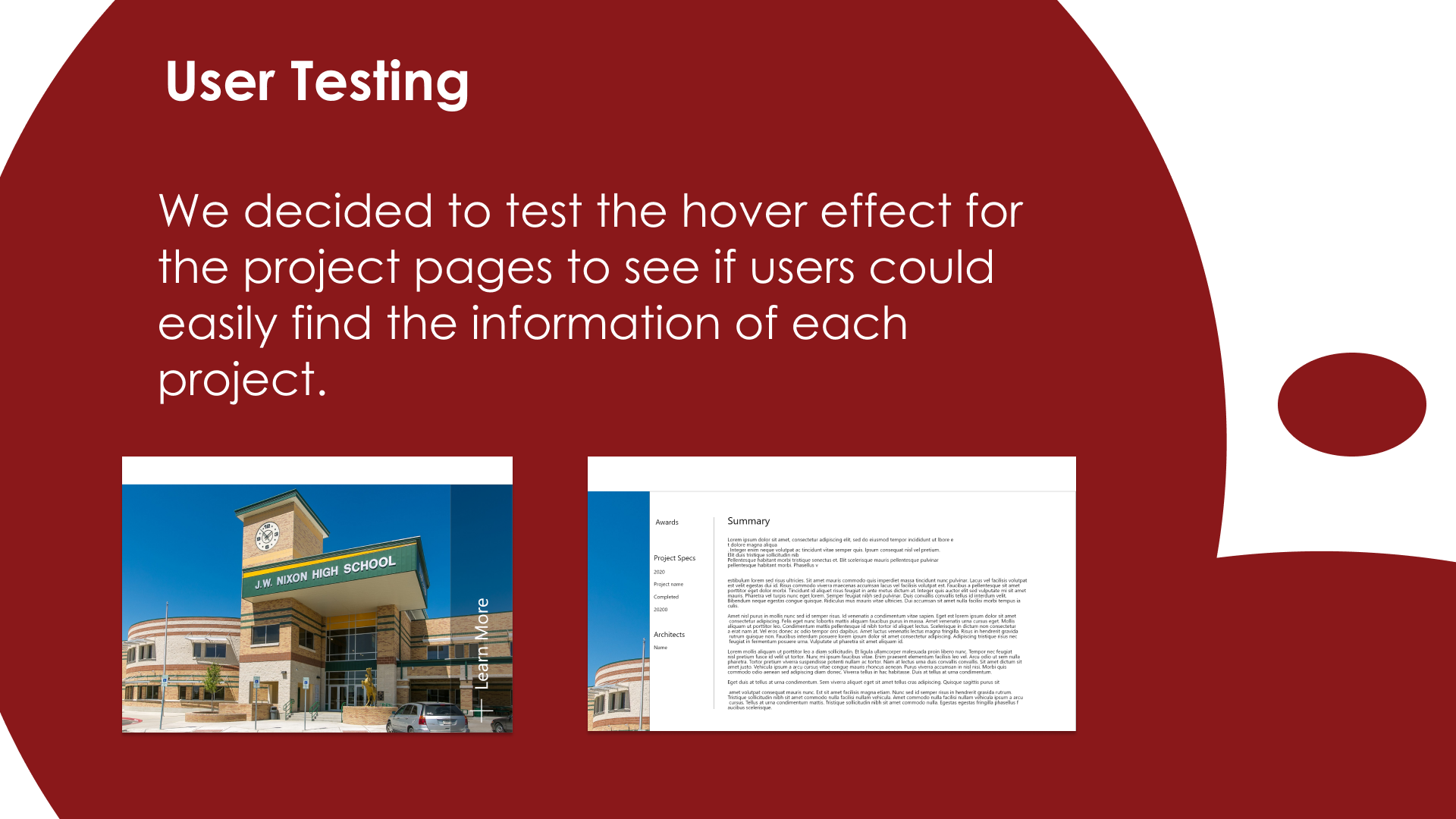
Because we focused our efforts on content mostly, we felt the most important aspect of the prototype to test was the projects pages. Sticking with the minimalist feel, we went with a slide effect on click.
The results of the tests made it clear that it was difficult to find the hover CTA. Without knowledge of the CTA, users could not find the project specs and thus the page was no longer of use to them. We now knew we needed to find an easier way for users to access this information.
We did this by restructuring the pages to layout the project specs within the page itself. By getting rid of the hover to slide effect, we made the page easier to use without removing the modern look.
Looking to the future, we are looking at reinstating the blog for SEO purposes. While the client was not fond of it and didn’t make much time to write blog pieces, we are planning on having a member of the team work with them to create a better opportunity for SEO.
Additionally, as Liquid uses custom Wordpress websites, I’m working with the developer to create a simple backend that the client can use to update their site.
