City of Laredo Utilities Department Website Redesign

Timeline: 6 months
Project Size: 60+ pages with WordPress dynamic backend
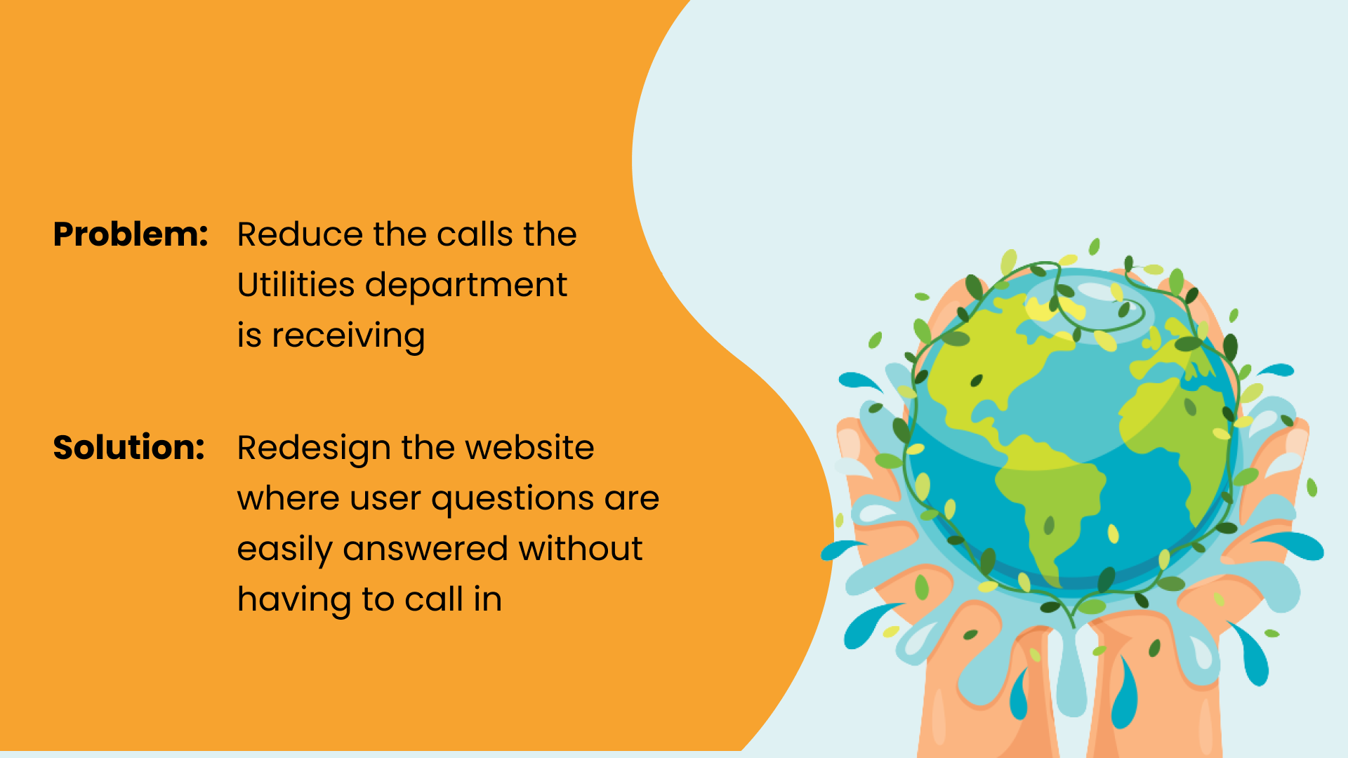
I began this project with the intent to not only help the City of Laredo Utilities’ department customers but to help the department itself. To put it in a nutshell, the staff was incredibly overwhelmed and needed help reducing their calls. The website has since reduced their call intake by 30%. I believe this number will continue to drop as we update the FAQs which will answer many of the common questions the customer service staff receives on a daily basis.
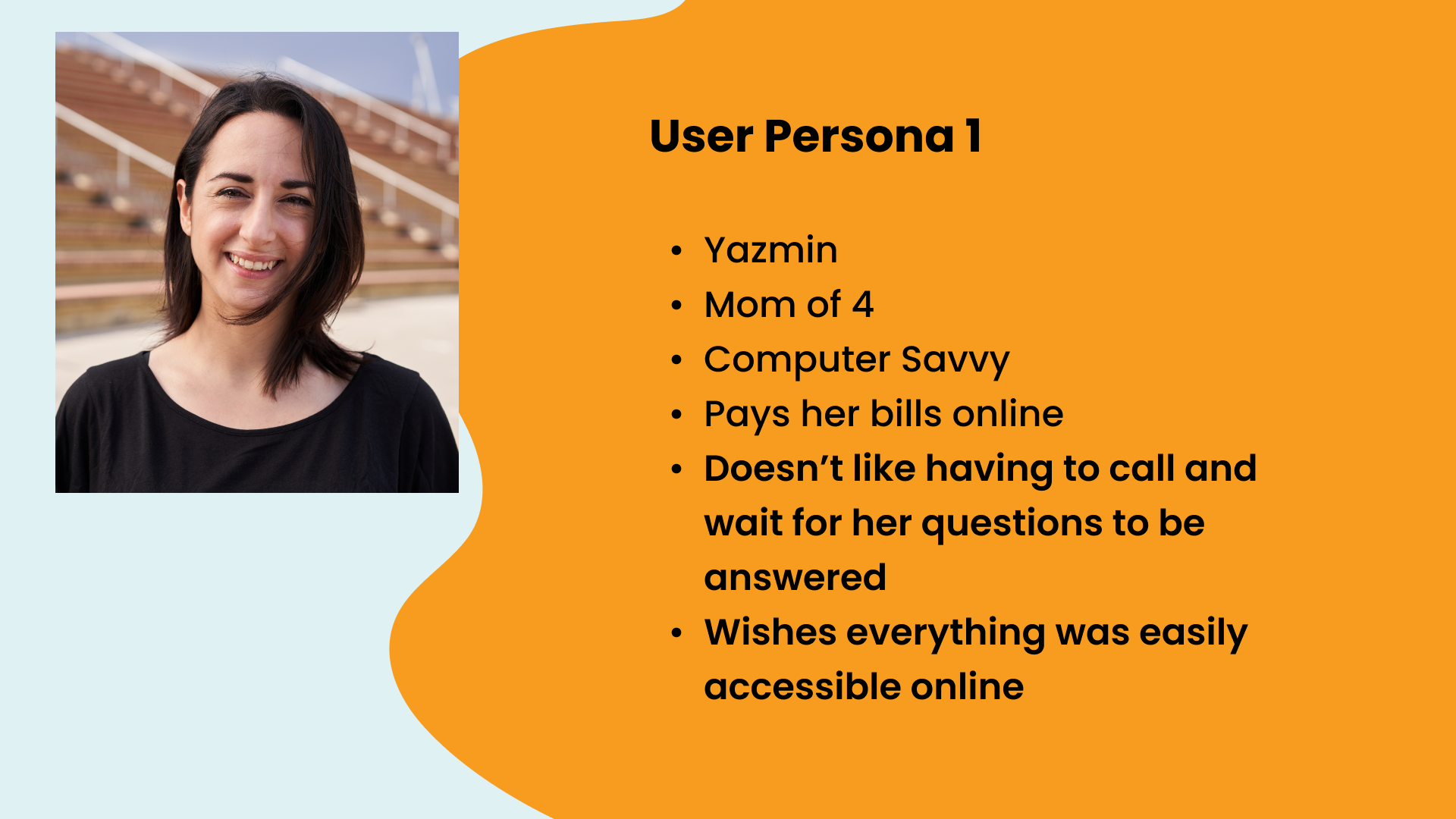
While the budget didn’t allow for user interviews, it did allow for many meetings with various staff members particularly customer service. They told me they’re were two main kinds of people calling in: those who were using the website and couldn’t find what they were looking for and those who typically call to pay their bill.
This is where User Persona 1 comes from; here we have Yazmin, an average mother of 4 who typically does the billing for her family. She’s accustomed to everything being online and hates when she has to call customer service because the long wait times are an annoyance.
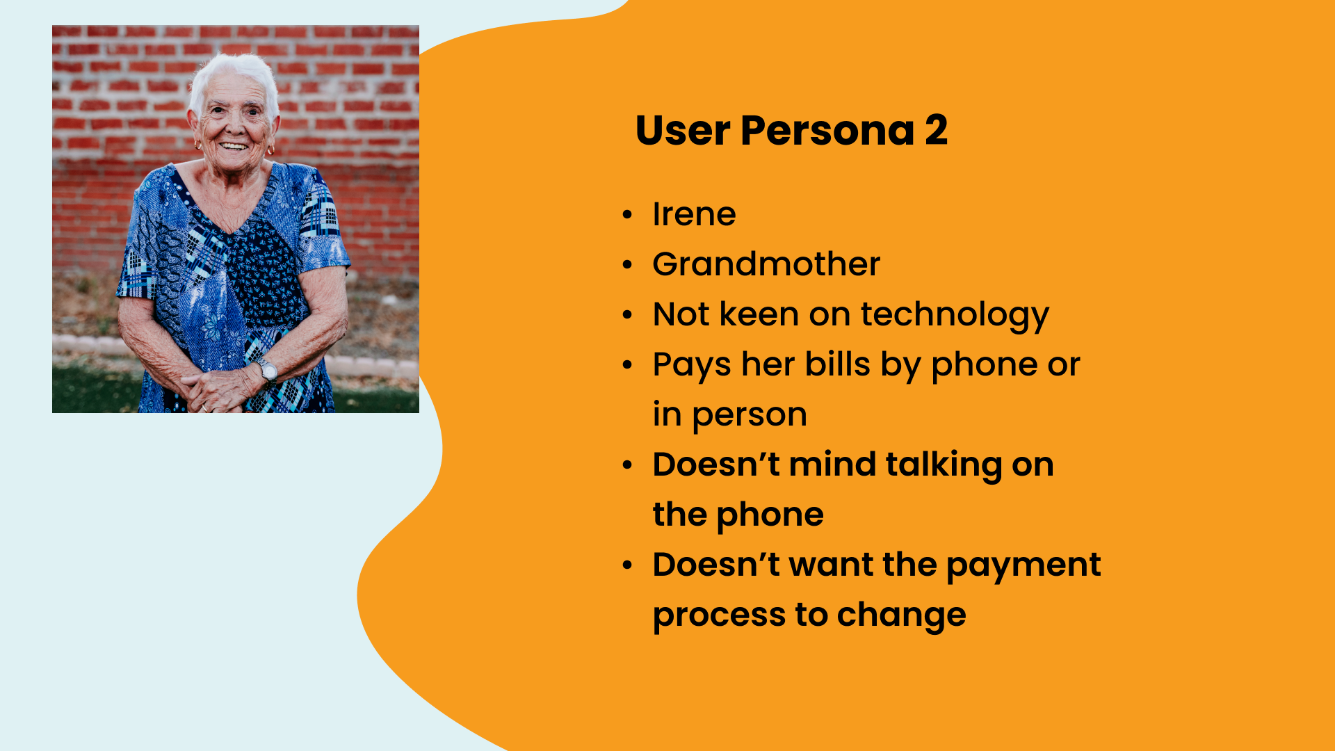
Then we move to User Persona 2: Irene. She’s of an older generation and feels more comfortable calling or going in person to pay her bill. She doesn’t mind being on the phone with customer service and typically reaches out to them any time she has an issue.
I found learning about Irene insightful. I didn’t want to change the dynamic she had with Utilities and instead help Yazmin find alternatives to calling in for her issues.
With the many interviews I conducted with the department, I got a lot of insight about the current issues they are facing. They are very understaffed, particularly the customer service division and don’t have many resources to guide their customers.
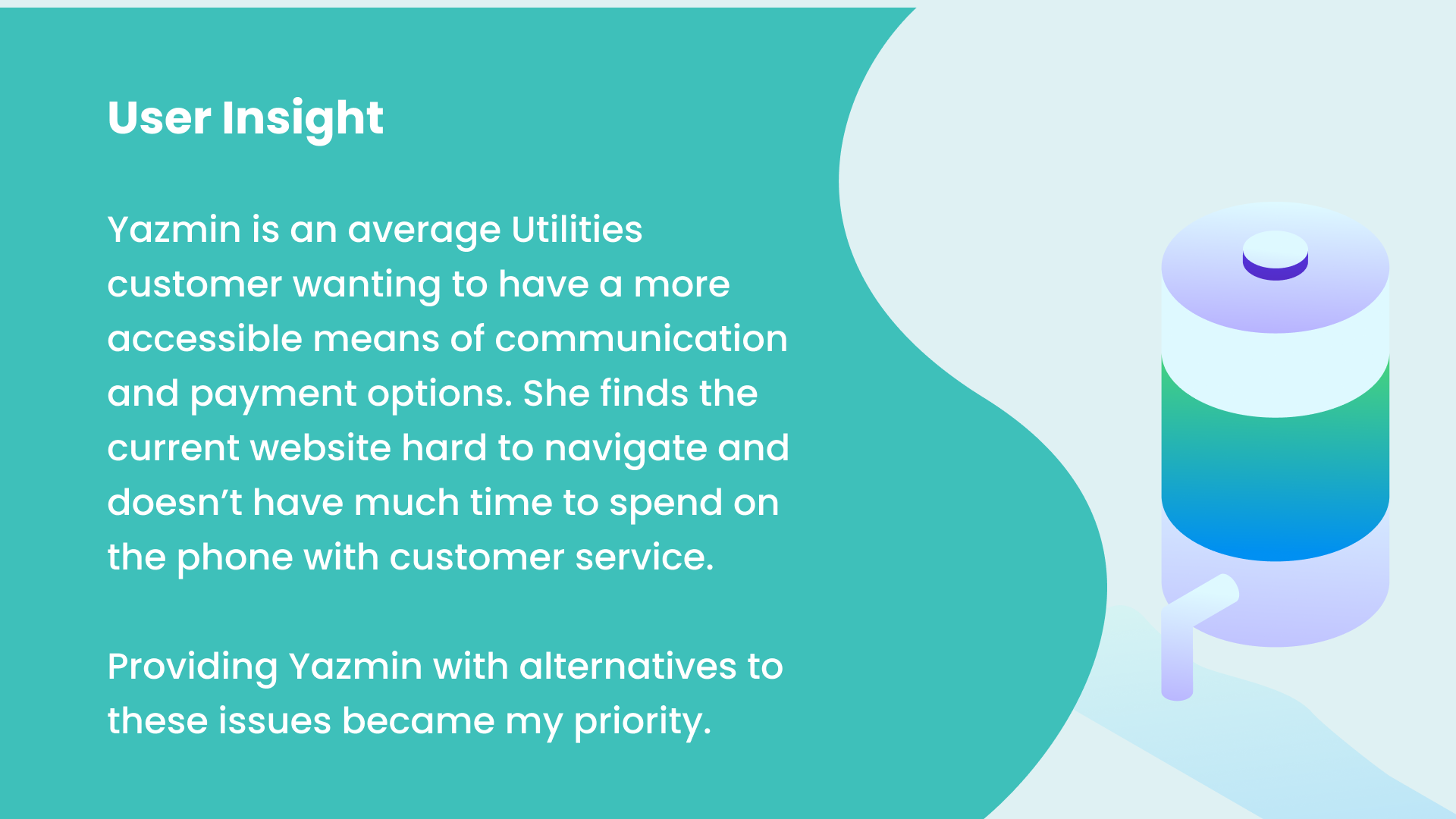
With all this in mind, I came to the conclusion I needed to help Yazmin find alternatives to phone calls for her questions and payment. The current website doesn’t answer her questions and spending an hour on the phone with the department isn’t an option with her busy lifestyle.
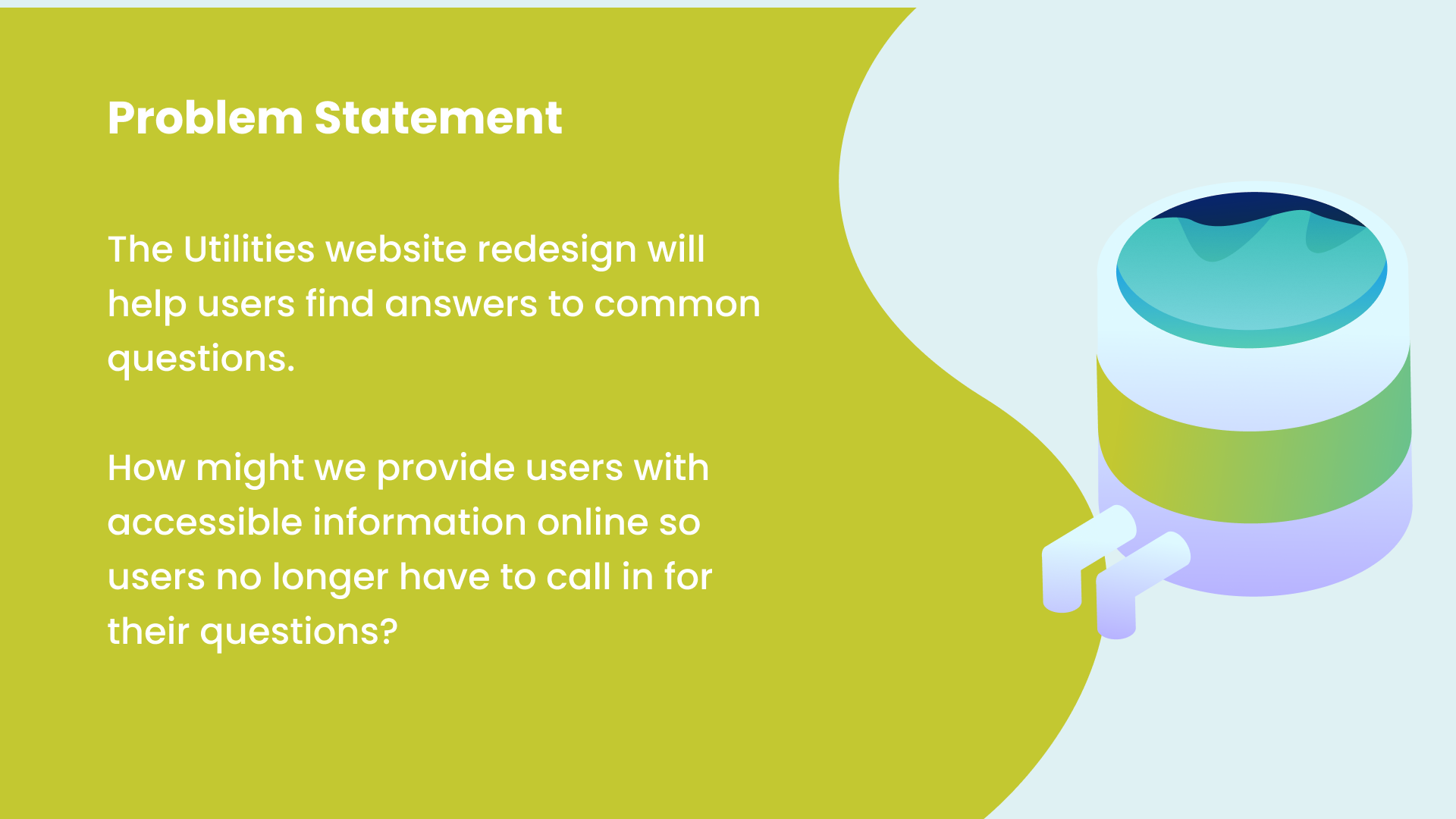
With a user insight in mind, I was able to define the problem. Questions were not being answered on the current website. Meaning there’s a lot of missing information and a lack of resources for customers. How can I provide accessible information online where users will no longer have to call to have their questions answered?
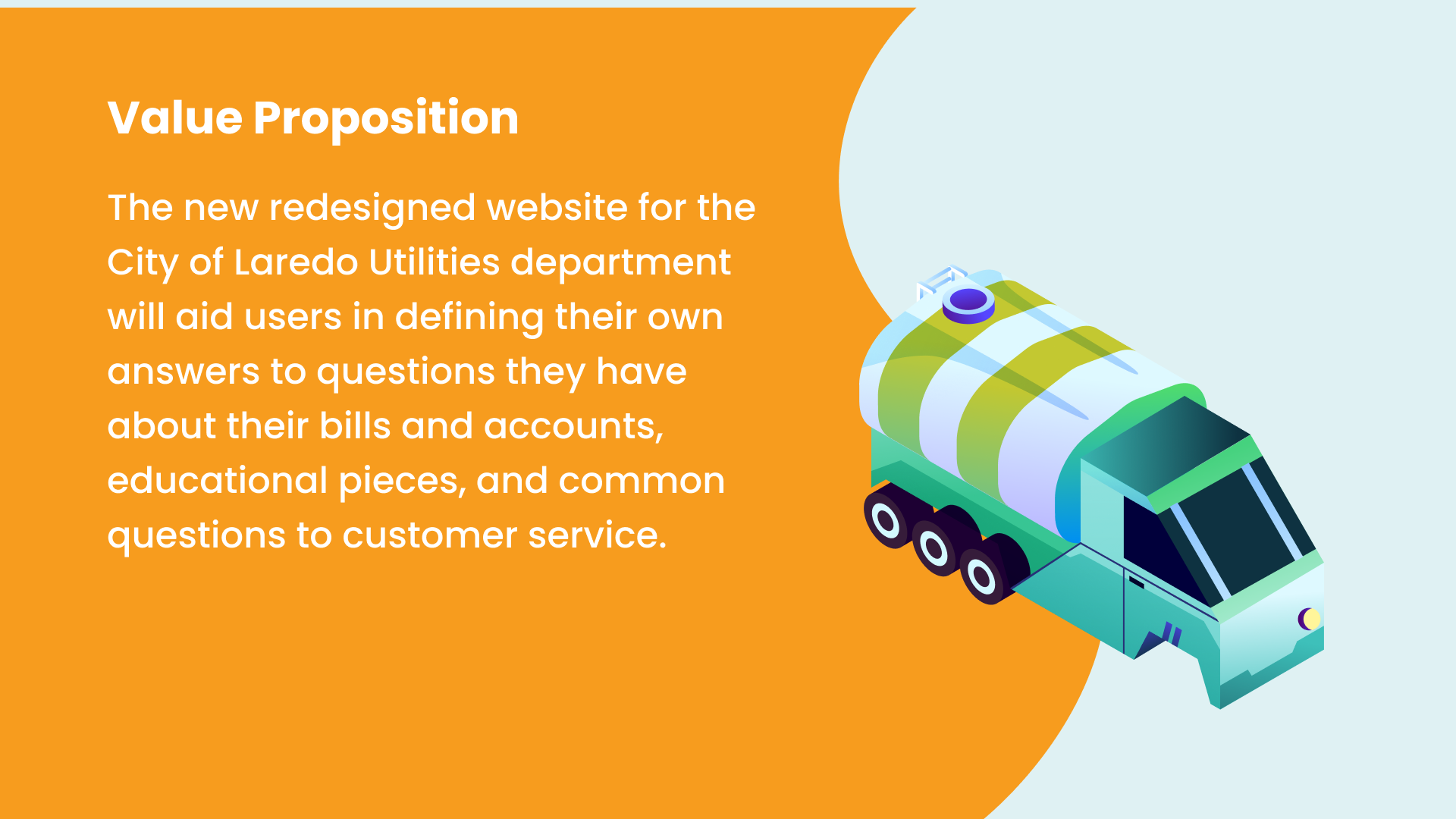
After getting much insight from the staff, as a team, we decided that customers needed help most with information on bills, accounts, education, and miscellaneous questions.
After defining our potential solution, I went straight to drafting a sitemap. I did research on other sites such as the City of Denver utilities’ website. They created a lot of the type of content we needed and I was able to model my sitemap after theirs while tailoring it to meet the needs of the client.
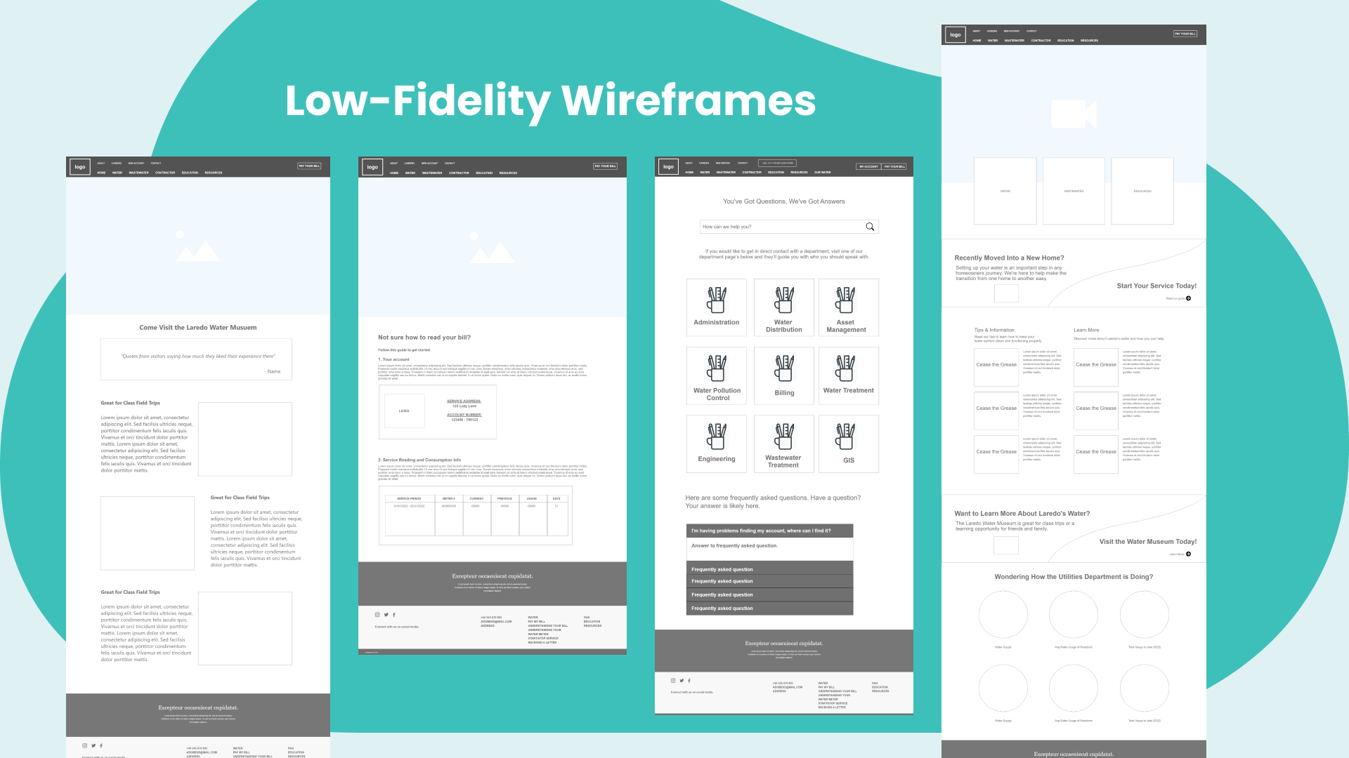
With a sitemap laid out, I began low fidelity wireframing. I designed the main pages we had been discussing such as the FAQ’s, how to read your bill, and the homepage.
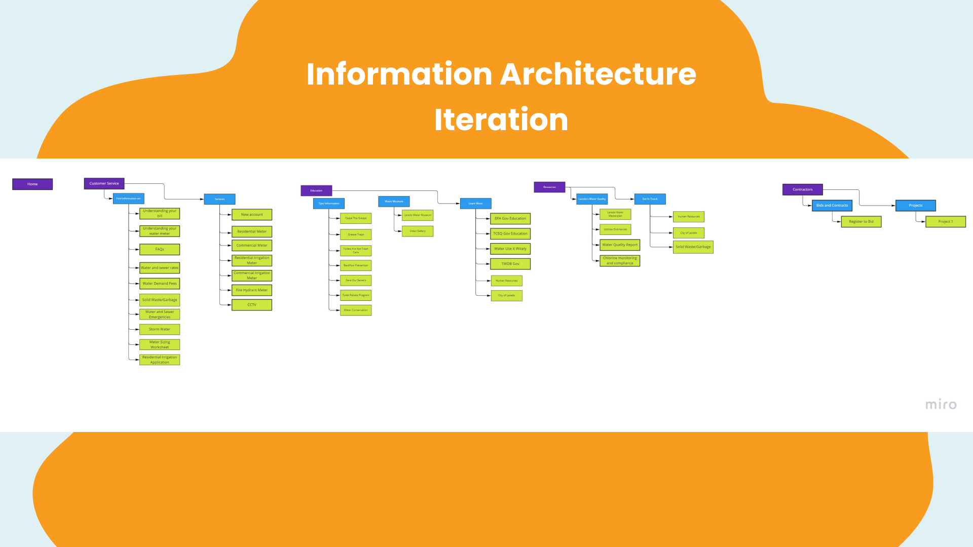
After seeing the wireframes, I worked with my client to determine if we were hitting all the key points. And by the looks of it, we had gone off too far. We decided to reduce the size of the sitemap and focus on what was really important: the questions of the customers.

Now that the sitemap was clear, we were ready for high-fidelity development. I began designing the look and feel of the website, utilizing our graphic designers talents to help custom make icons and graphics to fit the feel I was going for.
I wanted the site to look modern and trustworthy as the department was having issues with their branding due to boil water notices in effect at the time. Providing a comforting feeling with the water concept and friendly font, helped achieve this.
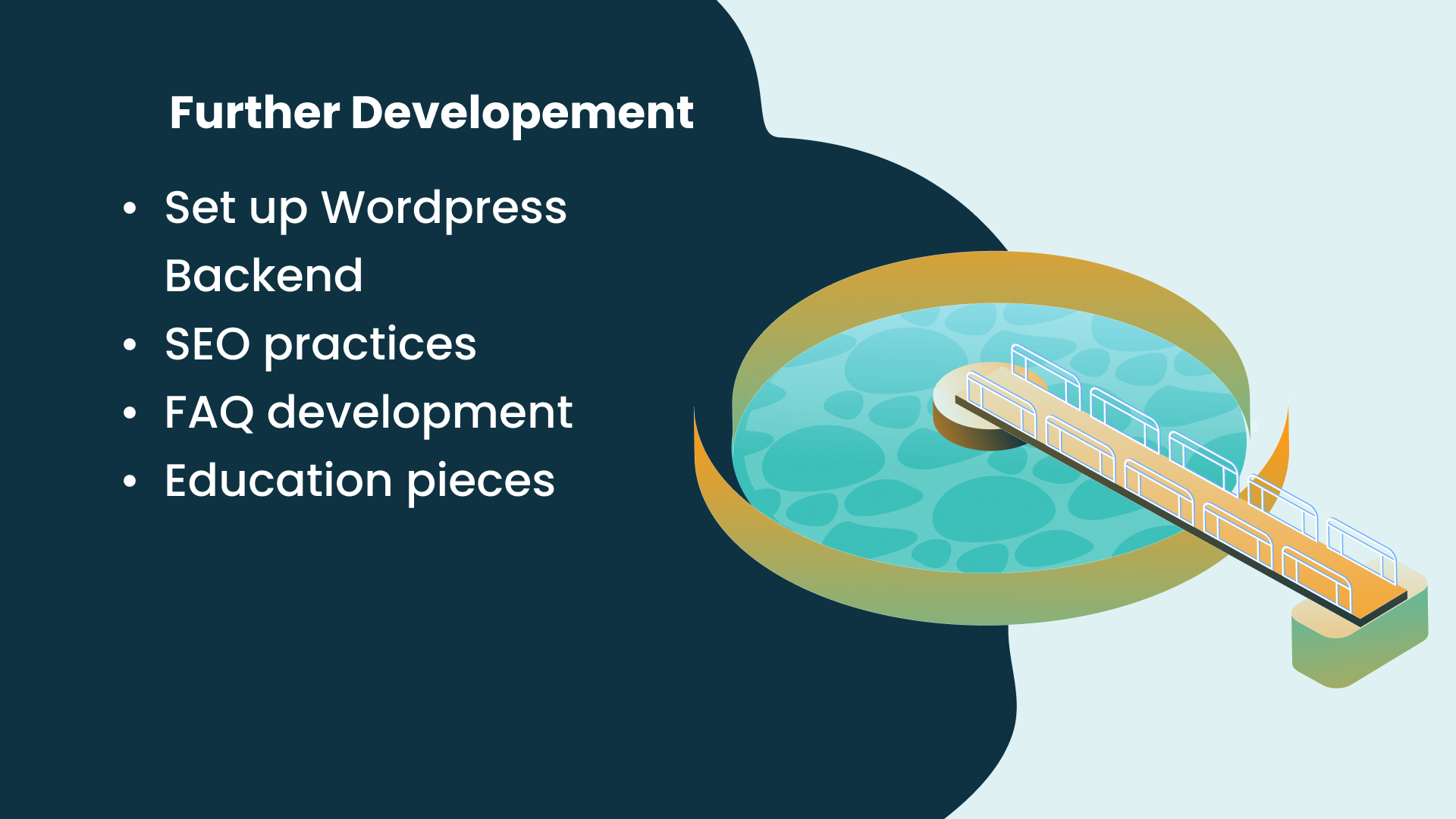
While this project is launched, a project is never truly complete. There’s still much I’d like to improve on the project. Along the way, I had trouble getting all the information I needed for the FAQ pages so I focused more on general content pieces instead of specific questions. I’d like to delve deeper into those questions and help find answers to them.
I also spoke with my main point of contact and she mentioned they might make some new educational programs so I’d like to help in the development of new pages on the website focusing on those topics.
Thank you for reading this case study, if you have any questions, please feel free to contact me at isabella.i.rosales@gmail.com. I can provide more detailed information on the project if desired.
